


The 8 Most Common Logo Design Mistakes (And How To Avoid Them!)
Logo design is all around us. After all, it’s the single point of recognition representing company’s ideology in one single graphic. However, creating a unique and memorable logo is not as easy as it sounds or looks. The following is a list of common mistakes companies make when creating a logo, and how to avoid those pitfalls.
1.) Designed By An Amateur
If you consider yourself a professional, then you’d better look professional. A lot of business owners invest in offices, furniture, and computers systems. However, for many, that investment does not extend to their logo design and branding. It’s a common mistake to think that you can do it yourself, or that you can have a novice do it.
I understand, a good designer is hard to find and they can be a little pricey. But hiring a novice is just about the worst thing you can do if you want to look like you're a professional. They rely heavily on trends and don’t take into account what the look or brand of the company should be to the public.
Graphic design is a flooded job market, with many “professionals.” Like many things in life, there is always someone that can work cheaper, but you’ll nearly always get what you paid for. Take a look at their previous work, and compare it to these principles of logo design:
Simple
Usually, you have about 1–2 seconds for someone to remember your logo.
Memorable
You should be able to draw the logo again after only seeing it for 2 seconds.
Fresh
Never do what your competitors have done. Uncomfortable.
Balanced
If your logo looks like it's about to fall, it’s uncomfortable to look at. Whether people consciously know it or not, unbalanced images don’t create a professional vibe.
Versatile
Remember your logo will be on print, web, shirts, etc. Most of the time it will appear at the size of about an inch. Tags lines are not visible and complex designs will become very difficult to see. Also, having a vertical version and a horizontal version is always a smart idea.
2.) Relies On Trends
Clichés will never be remembered by anyone. As you go about your daily life, start looking at logos on billboards and storefronts. You’ll be surprised at how many swooshes, bevels, glowing effects can be found on logos. A great logo should be timeless and simple. Classic great logos that last the test of time? Apple, Puma, IBM, etc.
Logolounge has a great section on its website in which it updates current logo design trends. Checking logo trends will make a decision easier.
3.) Uses Raster Images
This is probably the easiest (and most important) thing on the list. Essentially, a vector graphic is line art that can be stretched to any size and can’t become blurry. It is not reliant on pixels (i.e. Adobe Illustrator). Raster graphics are reliant on pixels and resolution, like when you zoom in too much on a photograph.
You'll always want a vector version of your logo, make sure to request it as a deliverable. If you are about to hire someone that doesn’t know the difference between a raster file and a vector file, I guarantee, they are not professionals that should be doing work for you.
4.) Contains Stock Images
Other than a shout-out of “we’re not unique”, the real problem with stock images is the legality. If you do decide to use stock art, you need to make sure you can legally use the image in your desired capacity. Always check the usage rights for imagery.
5.) Designing What the Boss Thinks Looks Cool
Your company’s logo should reflect what your company is and does. Not what a single person thinks looks neat (such as using Old English for a technology company’s logo or an image or the CEO's dog as a silhouette). It’s easy for personal opinions to influence logo creation (after all, everyone is an art critic), but personal opinions don’t always translate to the timelessness needed to ensure the longevity of your logo.
6.) It’s Too Complex
Taglines and other some elements will be lost. Remember you only have a second to get someone to remember your logo. A simple icon should be enough to get someone’s attention. Below is an example of a complex and simple logo design. Look, and close your eyes, of the two, which one do you remember?
Complex:
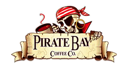
Pirate Bay Coffee Company Logo - Example of an overly complex logo
Simple & Timeless:
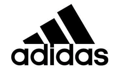
Simple and Timeless Adidas Logo
7.) Font Choices
NEVER use these fonts:
  ECOFONT

  SOUVENIR

  GILL SANS LIGHT SHADOWED

  BRUSH SCRIPT

  PAPYRUS (ugh, it's the worst!)

  NEULAND INLINE

  RANSOM NOTE

  ARIAL (Helvetica’s ugly cousin)
Any pro designer stays as far away from these fonts as possible. They are hard to read, ugly and cliché. Gross. If it takes effort to read a font, you don’t want to use it. People shouldn’t have to work to understand what they are seeing.
8.) Your Logo Copies Others
This is, hands-down, the biggest mistake of logo design. With the ability to grab whatever graphics you want off the web, it’s becoming more common. The point of a logo is to represent your company. Logos that are unoriginal do not get noticed. Going for the same feel as another logo is something you can tell a designer, but copying is never a good idea.
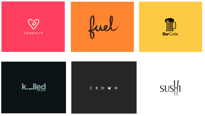
Examples of great logo design (Source)
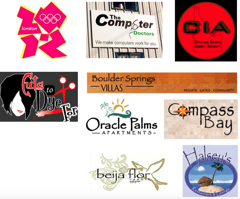
Examples of Bad Logo Design:
So, if you aren’t a designer, how do you know whether or not your logo will work?
Here are two quick tricks you can use that will tell you if the logo design you’re considering fulfills the “make it memorable” and “keep it simple” principles:
Trick #1
Print your logo on an 8.5 x 11 sheet of paper (don’t fill up the page – make it about 1 inch high)
Hand that paper to people who haven’t seen the logo or been a part of conversations about the design project (in other words, pull a guy off the street)
Ask these people to look at the logo – for just 2 seconds!
Now ask each to describe it to you.
If your logo’s intended meaning was immediately clear to them, you’re onto something!
Trick #2
Put your logo and 8 others on a piece of paper (arranged in 3 rows of 3); make sure they’re about the same size.
Show this to as many people as will participate. Let them view it briefly – no more than 30 seconds, but at least 15.
Take the paper away and ask viewers to recall and describe as many as they can – is yours among them?
So, there you have it! If you’re in the process of logo creation or considering a logo rework, be sure to use this guide to ensure that your logo is simple, memorable, and demonstrative of your unique organization.
Are you a beginner looking to create a logo on a small budget? Our friends at FirstSiteGuide have put together a guide just for you. Check it out here!


Trust us, you’re gonna want this in your inbox.
Join the Irish Titan sphere of influence. We'll send a couple emails a month. No trash, no spam, just the shenanigans we get up to.
More reads


More from Musings...


2024 truly wrapped. While some 'Wrapped' summaries (cough Spotify cough) jump the gun in early December, we took the time to gather, survey, and reflect on the entire year.


Custom solutions offer tailored functionality for unique needs but come with higher costs and maintenance. Native features are cost-effective and easy to implement but may lack flexibility. Apps provide specialized tools but can create dependencies and added expenses.


By Nate Levine, User Experience Engineer at Irish Titan. Heat maps are a type of data visualization tool that illustrates how users interact with your website. They use color coding to represent the level of activity across different parts of your site—think of it like a weather map, but instead of showing temperature, it shows user engagement. The hotter the color (reds, oranges), the more active the engagement with that section, while cooler colors (blues, greens) indicate less interaction.
